Friday, September 20, 2013

Figurative Fridays: The Beginning

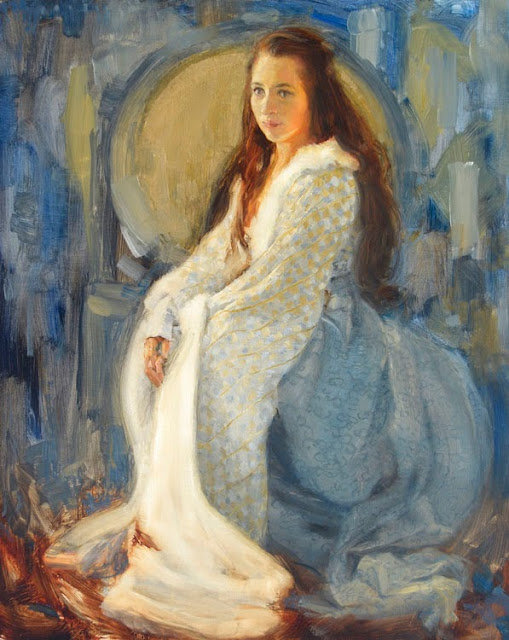
The beginning is a very delicate time.


I've been at work on a lot of new pieces recently. When I start a painting or drawing sometimes I get slowed down by the huge amount of possibilities that present themselves as you begin.  Every mark you make presents a new road you can take. How do you present the figure? Even a slight change of the hand can change the whole feel of the painting.  

Sometimes I take a road that is a dead end and have to reverse course. Many times as I work a new road presents itself that I didn't even consider before I began. Those are some of the funnest moments in a painting. I have heard them called "happy accidents". It can be magic as you paint. 

Every time I make a mark on the canvas my mind perceives new possibilities. They can freeze my progress if I am unsure which path to take. So many possibilities. Am I making the right choice? When I was teaching Life Drawing and Painting at Brigham Young University I had many students that got hung up on making all the right choices. They would sit dawdling around, paralyzed with indecision. They were afraid to make the wrong choice so they never made one. Often I just had to come over and prompt them on a road, it almost didn't matter which, as long as they started moving they would be able to develop a painting. There are many wonderful roads. How can you know what road you want to be on until you've walked down many? In fact I have often take a wrong path in my paintings. But if I don't start walking I'll never see the fruition of any of my ideas.

Even some of my favorite pieces have a shadow of "What if I had taken a different road?" to them. That is why you can tell an artist how much you love a particular painting and he or she may not be completely happy with it. Sometimes all those competing possibilities they still see on their canvas can overshadow the beautiful path that was taken. 

Now that I have painted for many years I've begun to be able to appreciate each trip without obsessing about paths not taken. But still . . . the untaken road captures my imagination.

For example, one of my ballerina paintings: "Backstage," is a painting that highlights a path taken when many presented themselves to me. In my initial lay-in I really liked the rough unfinished quality of the paint. I could have polished every detail, defining each feature.  
Backstage (rough)
14" x 11"
Oil on board
However, as I finished the painting I endeavored to keep it a bit raw and rough with only selected details and fun paint. I felt it really emphasized the hard athletic work involved in ballet. I quite like the results, but . . .what if I had really tightened up her face and torso?  I could have really emphasized her beauty. It would have been a completely different painting. Not necessarily better, but another good road taken.
Backstage (final)
14" x 11"
Oil on board

Wednesday, September 18, 2013

Wednesday Wanderings: Old Friends

"Never say there is nothing beautiful in the world anymore. There is always something to make you wonder in the shape of a tree, the trembling of a leaf." -Albert Schweitzer.
Among the Tumbled Rocks
8" x 10 "
Oil on Board

One of our great joys in buying our older home was the mature trees on our lot. It can get very hot in the summer in the high desert.  And the wonder of the shade of a tree is greatly appreciated.  There is something very comforting in the shade of a tree.  In fact it's hard to imagine our house with out those trees. They are old friends at the end of the day.

Wise Old Cedar
12" x 9"
Oil on Panel
The same familiar comfort can be found in the surrounding red rock desert.  Nothing anchors the beauty of the canyon rocks like a tree. In our desert we are blessed with the twisty gnarled pinon trees. Painting these beauties is one of my favorite subjects. It's amazing how tress can thrive in so many harsh conditions. Every tree tells the story of its struggles. Each tree is a unique individual. The winter wind  twists and turns the branches the summer sun scorches the bark. Each struggle the tree endures gives it more character.


Wise Old Cedar
12" x 9"
Oil on Panel

Guardian
10" x 8"
Oil on Board

Friday, September 13, 2013

Figurative Friday: Perception

It's fun to revisit a theme after a long time.  As time goes by you have different experiences. They change you and your perspective changes with you. 

Some people think painting is just copying what you see. Really, painting is a process of interpreting what you personally perceive. The human eye receives vast amounts of data, but it's up to the mind to sieve though and find the information that it feels is useful and relevant. 

You can find many interesting examples of how the the mind edits what it sees in documentaries on psychology and perception. My favorite is the one where subjects watching a video were told to focus on how many times players pass a basketball. Subjects counted the passes and often came up with the right answer. BUT. In the middle of the video, a man dressed up as a gorilla walks onto the basketball court, pounds his chest, and walks off the opposite side. The subjects in the study didn't even notice the gorilla until the scientists directed their attention to it and showed the video again. You can see more about it on Dr. Chabris and Dr. Simons' website: The Invisible Gorilla. Magicians have used this mental editing to their advantage for centuries.

I've mentioned this before: as an artist you must train yourself to look beyond what you initially perceive and really see what is in front of you. I have heard it described almost as a form of meditation. Just as you can have a focus point in meditation, when painting you can choose to really focus all your attention on your subject. 

That being said, there is a vast amount of information in front of you. You must choose your battles as you paint. What is it you want to say about what you see? Is there an overriding element that intrigues you? What visually impacts you the most? You have to see the gorilla and then choose whether you want to include it in the painting.

Creating a good piece of art is hard mental work. If you were to sit down and watch me work you would see me stopping and staring at the canvas a lot. It's not because I've forgotten what I was painting, it's because I'm constantly analyzing how what I've put down is being perceived. Does it say what I want to say? Is it understandable? Does it please and interest the eye? Does it relay my perception? Is it significant to my own human experience?

The last question is critical. Part of your perception is your experience and you can reach a viewer more effectively by telling part of your own story.
A Sea of Trouble: Hamlet
16" x 20"
Oil on Canvas
That's  the main reason I keep coming back to painting Shakespeare's plays. His plays talk to me about the human experience in a universal way that has spoken to generations of audiences. Every audience finds themselves reflected in his characters. One of my personal favorites is Hamlet. He struggles through hard choices and we hear his internal thoughts as he struggles. Many of us forget to listen to our own voices as we thrash through life. I find it useful to be reminded. And it stirs up struggles that I've not settled that I need to ponder on. No wonder it has been such an enduring play.
The two paintings were finished years apart from each other.  The top is the earliest. Perhaps you can perceive some of the experiences I had between that time and the time I painted this one:
What a Noble Mind is Here O'erthrown: Hamlet
30" x15"
Oil on Linen

Thursday, September 12, 2013

Wednesday Wanderings: S'winter!

Oops. Wandering Wednesday has somehow slipped into Wandering Thursday. And also, I missed a week. Well, I guess that's what wandering means, anyhow.

As Fall begins to creep in I can't help but think about the cold season coming. Those early snowfalls make great dramatic painting possibilities. You still have some of the great warm colors of fall contrasted with the cool white snow.

That is what happened for me in the painting below. Not only did I get the snow but I also had some of the warm colors of fall left over. There were beautiful water and slush pools reflecting everything around them. And the snow covered mountain barely shows up against the grey sky.  Even though it was cold and wet it was beautiful to be there.

Verdure valley
11" x 14"
Oil on board
So get ready to enjoy the change of season.  I especially look forward to Fall, although it's a brief season here in the Four Corners.  There are great opportunities for dramatic cool to warm paintings for all you painters out there.

Friday, August 30, 2013

Figurative Fridays: Sometimes You Have to Choose the Dark Side

Today, I'm going to talk a little more about sketching.  Although these design principles can be applied to any medium.

In any particular drawing or painting there is an overriding idea you are working with. For example in the drawing below I was very interested in the dramatic lighting of the character. The light was very stark and I had to choose a side to join: I can only make a limited range of values with a pencil.  Would I use my available tones for the Dark side or the Light side?  You can see that I chose the dark side as I used almost all my tonal values describing the shadows.  I left the light side of the range almost completely as the white of the paper.  This focus on the shadow side increases the drama of the piece and complements the subject's pensive pose.
 Pensive Sketch by Richard Lance Russell
Other times, like this concept sketch for the Gilded Butterfly painting, I'm working out the overall shape and flow of the image I want to create.

Gilded Butterfly Sketch by Richard Lance Russell

Gilded Butterfly Painting by Richard Lance Russell
Gilded Butterfly
20" x 16"
Oil on Panel
I often use a sketch as a way for my mind to work out visual ideas. Sometimes it is helpful to have a visual note of my intentions to look at as I work. 

Not all drawings are intended to be complete finished works of art. In fact, some just don't work out at all. Although I will say, often, because of their strong focus on one idea or element, the process sketches themselves can be beautiful in their own right. 

So don't be afraid to play around and risk some ugly drawings, oftentimes it is the happy accidents in sketching that have given me the inspirations for my favorite paintings.

Wednesday, August 28, 2013

Wednesday Wanderings: The Process of Painting A Landscape Vista

Today for your weekly Wednesday Wandering fix: I'm posting sequential images of my latest landscape painting. It's a gorgeous vista at Island in the Sky in Canyonlands National Park, amazing in itself and really fun to paint.
Although I do sometimes tone my canvases, I really like the vibrancy and transparency that you get from working from white with light washes of color, so I started this one with a white-gessoed board.
I started out with the sky.  First because it is the largest shape in this composition, but I also started with it because it is such a large cool blue area and I don't want to be blocking in the warm and cool colors at the same time or my colors will quickly turn muddy.
I worked the general shapes of the clouds out initially.
After refining the color of the clouds a bit I broke out the warm colors to block in the canyons below.
Next I tackled the very tricky skyline border between the warm and cool colors.  There is actually quite a long time gap between these two pictures. Whenever I paint this area in a landscape I am always amazed at how high keyed those midland colors are.
Since I had a hold on the the transition skyline values I started defining the canyons themselves.
Next I looked for edge-defining highlights and hit those.
Here I was working on more definition of the canyons.  You'll notice I was still adjusting general values and warming up the light sky peeking through on the left.
It is a little hard to see in these smaller images but here I was still refining canyons and playing with my brush work to create fun and interesting paint strokes and shapes.
Now that I had my canyons well defined I jumped back up to the clouds. With the very warm sunrise color and values of the canyon completed I could see I needed more warmth bounced up into the clouds. Additionally I felt the clouds' edges need to be softened to emphasize the sharpness of the canyon walls.
And here is the finished piece with the addition of the all-important signature.

Now let me say at the end of this post, that the pictures were not evenly timed as I shot them. Frankly sometimes I got a little involved with what I was painting and would finish up an entire area before I remembered to get up and push the camera shutter.  But a lot of the major decisions were documented in this sequence.  Anyway, it's a little glimpse into my painting process.

Friday, August 23, 2013

Figurative Fridays: The Number 2 Pencil

Sometimes it's fun to pull out the old number 2 pencil and draw. I think most of us are most comfortable with this instrument because of our many years doodling on the sides of our schoolwork assignments. 

One of the joys of drawing is working in simple value (you know, the darkness or lightness of something). When drawing, you are automatically forced to analyze and simplify the world to black and white. Half the work of simplification of form is already done for you. Even with that narrowing of the visual field, the ways you can choose to make your marks are endless.

Are you using line with the tip or shading with the side of your pencil? Will you choose to concentrate on value and tone? Working with edge and contour? Perhaps you want to distort certain elements and use caricature and cartooning in your drawing.  
Pencil on paper

In this drawing I concentrated on the contour or the line that defines the edge of the form. I also wanted to think about the direction of each line and the emphasis "or darkness of the mark" I used. I threw in a bit of tone to define the shape as well. Usually I make these little sketches to work out the direction I want to go with a painting. As I work, I ask myself: what are the most important bits of this image? Is it readable to the viewer? And is it saying what I want it to?

So, everyone, break out the old number 2 and start drawing!